React and React Flow
React is a popular JavaScript library used for building user interfaces. It allows developers to build reusable components that can be combined to create complex UIs with ease. React Flow is a library built on top of React that provides a set of components for building interactive node-based UIs, such as flowcharts, diagrams, and graphs. In this blog, we will discuss why we used React Flow, its main functions, and what makes it unique.
Why React Flow?
React Flow provides a simple way to create interactive node-based UIs. It's built on top of React, which means that it integrates seamlessly with other React components and libraries. Additionally, React Flow is highly customizable, allowing developers to create unique visuals and behaviors for their flowcharts, diagrams, and graphs.
Main Functions of React Flow
React Flow provides a set of core components that can be combined to create powerful and complex node-based UIs. Some of the main functions include:
- Drag and drop nodes
- Connect nodes with edges
- Customizable node appearance and behavior
- Zoom and pan
- Multiple selection
What Makes React Flow Unique?
React Flow stands out among other libraries for building node-based graphs and diagrams for several reasons:
-
React Integration: As the name suggests, React Flow is specifically designed for integration with React applications. It leverages React's component-based architecture and state management, making it easy for React developers to incorporate complex graph visualization into their projects seamlessly.
-
Customizability: React Flow offers a high degree of customizability, allowing developers to style and configure every aspect of the graph components to suit their application's needs. This includes customization of node appearance, edge styles, interaction behaviors, and more.
-
Performance: React Flow is optimized for performance, ensuring smooth interactions and efficient rendering even with large graphs containing hundreds or thousands of nodes and edges. It achieves this by employing various optimization techniques such as virtualization and smart rendering.
-
Community and Support: React Flow has a growing community of users and contributors who actively maintain the library, provide support, and contribute new features and improvements. This means that developers can rely on a robust ecosystem of resources and assistance when working with React Flow in their projects.
-
Rich Feature Set: React Flow offers a rich feature set out of the box, including support for features like drag-and-drop node placement, automatic layout algorithms, zooming and panning, undo/redo functionality, and more. These features make it suitable for a wide range of graph visualization use cases.
-
Active Development: The React Flow library is actively developed and updated, meaning that it stays up-to-date with the latest developments in the React ecosystem and continues to receive new features, optimizations, and bug fixes over time.
Overall, React Flow's combination of React integration, customizability, performance, community support, rich feature set, and active development make it a standout choice for developers looking to incorporate node-based graph visualization into their React applications.
Installation of React Flow
Prerequisites:
To get started with React Flow, you first need to install it using npm or yarn. You can do this by running:
npm install react-flow
or
yarn add react-flow
Once you've installed React Flow, you can import the core components and start building your node-based UI.
Here's an example of how to create a simple flowchart using React Flow:
import React from "react";
import ReactFlow from "reactflow";

import "reactflow/dist/style.css";

const initialNodes = [
  { id: "1", position: { x: 0, y: 0 }, data: { label: "1" } },
  { id: "2", position: { x: 0, y: 100 }, data: { label: "2" } },
];
const initialEdges = [{ id: "e1-2", source: "1", target: "2" }];

export default function App() {
  return (
    <div style={{ width: "100vw", height: "100vh" }}>
      <ReactFlow nodes={initialNodes} edges={initialEdges} />
    </div>
  );
}
In this example, we're importing React and ReactFlow, defining an array of elements that represent our nodes and edges, and rendering a <ReactFlow> component with our elements as props.
The <ReactFlow /> component must be wrapped in an element with a width and height.
Want to dive into React Flow?
The above example provides a basic introduction to creating flowcharts with React Flow. However, React Flow offers many more features and customization options, including drag-and-drop functionality, automatic layout algorithms, zooming, and undo/redo functionality.
To explore these features further and learn how to customize your flowcharts, check out the React Flow documentation and examples.
Here's a link to learn more about React Flow: React Flow
Leveraging React Flow in WeDAA
At WeDAA, our platform is dedicated to empowering developers to prototype microservices efficiently. One key component of our platform is the ability to create well-defined architectures seamlessly. To achieve this, we turned to React Flow, a versatile library that enables the creation of interactive node-based user interfaces, such as flowcharts. Let's delve into why React Flow became an integral part of our architecture design process and the challenges we encountered along the way.
At the core of WeDAA's mission is the desire to provide developers with intuitive tools to design microservice architectures effortlessly. React Flow emerged as the perfect solution due to its ability to facilitate the creation of dynamic, node-based UIs. With React Flow, users can visually construct their architecture diagrams directly within our platform. This interactive approach not only enhances the user experience but also streamlines the process of translating these diagrams into well-defined code structures.
By leveraging React Flow, WeDAA offers users a visual canvas where they can intuitively design their architecture using nodes and connectors. This eliminates the need for traditional input forms and empowers users to express their architectural ideas in a more tangible and engaging manner.
Overcoming Challenges with React Flow
While integrating React Flow into WeDAA presented numerous benefits, it also came with its set of challenges. One significant challenge was ensuring seamless communication between the visual representation of the architecture in React Flow and the backend engine responsible for generating code based on the provided JSON.
To address this challenge, our team worked diligently to establish robust data exchange mechanisms. We developed efficient processes to capture the architecture drawn by users using React Flow and transform it into a structured JSON format. This JSON data is then seamlessly passed to the WeDAA backend engine, where it undergoes further processing to generate the corresponding code.
Empowering Architecture Design with Interactivity
Custom Nodes
A powerful feature of React Flow is the ability to add custom nodes. Within your custom nodes you can render everything you want.
Creating Custom Nodes
To create a custom node, you can leverage the newNode object structure as follows:
const newNode = {
    id: //unique ID you want to provide
    type: //type of the node we want to use for this specific node,
    position,
    data: { label: "label you want to display for that specific node" },
    style: {
      //style changes
    },
};
In the type field, specify the custom node type you wish to utilize. This approach allows for the creation of nodes with diverse functionalities, enhancing the visual representation of data and interactions.
Combining Node Functionality
React Flow also supports combining multiple functionalities into a single custom node. For instance, if you want a node to display an image and provide resizing options, you can achieve this by creating a custom node file and incorporating <NodeResizer> alongside your content:
return (
    <>
      <NodeResizer
        minWidth={60}
        minHeight={60}
      />
      <div>
        <img
          width="60px"
          src={image}
          alt="img"
        />
      </div>
   </>
)
This approach seamlessly integrates diverse features into a cohesive node representation, offering a comprehensive solution for complex UI requirements.
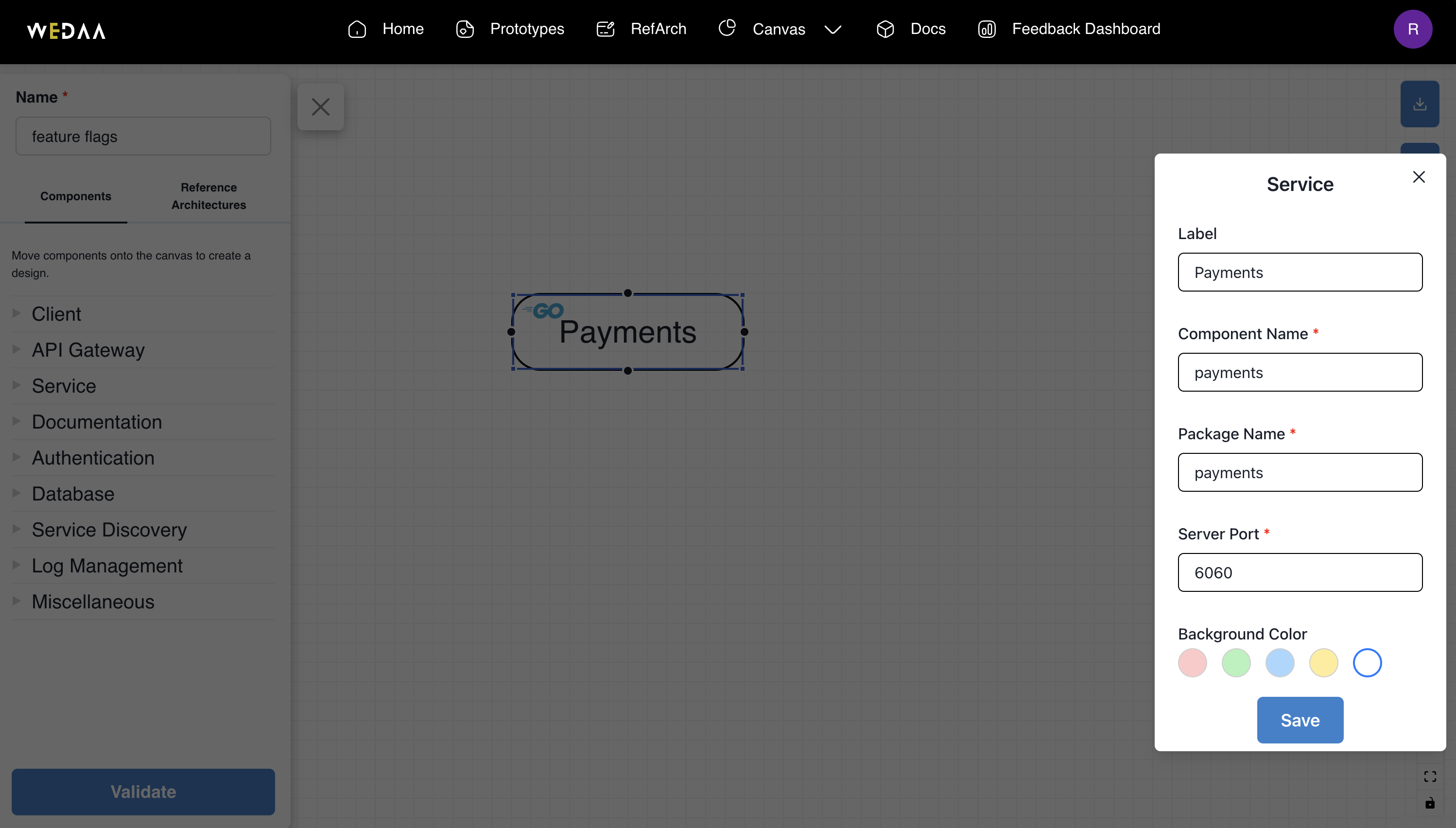
Example
The image below showcases a custom node used within a React Flow application. This custom node demonstrates the potential for creating visually rich and interactive elements within the flow diagram.
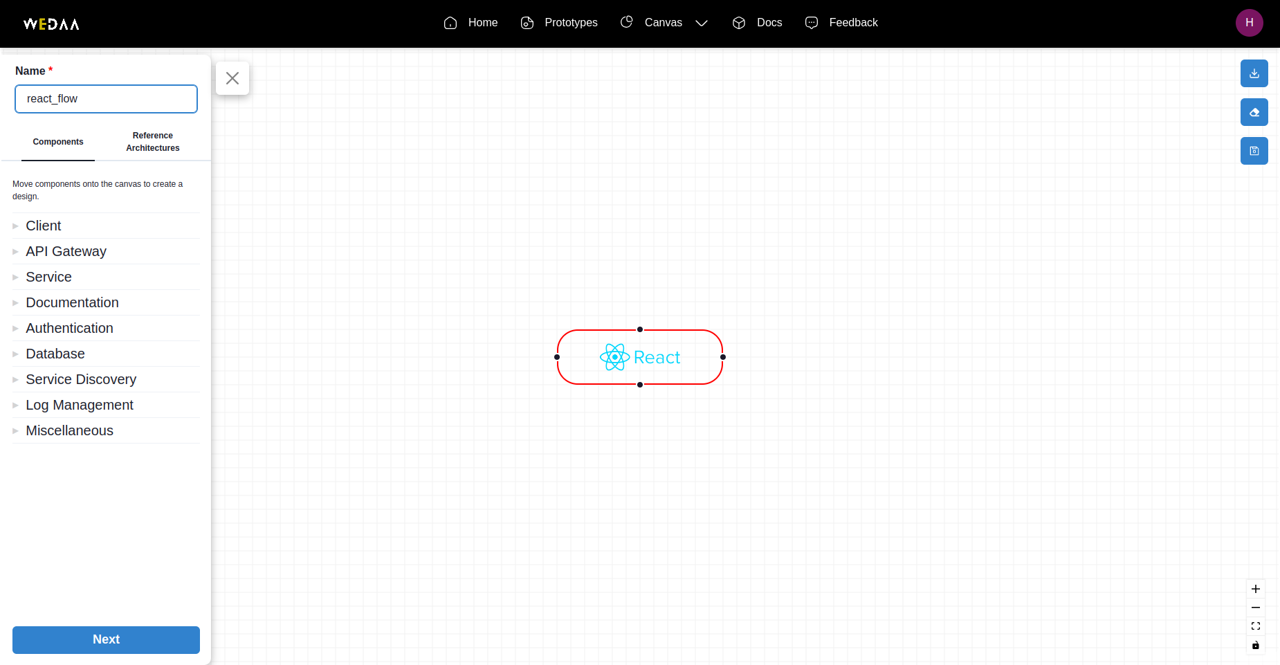
By leveraging custom nodes in React Flow, developers can unlock a world of possibilities for creating dynamic and engaging user interfaces.
Adding Handles to All Sides of a Node
To enable edges to connect to any side of a node, serving as both the source and the target, we can add handles to all sides of the node. This functionality enhances the flexibility and interactivity of our flow diagrams.
Implementation
First, let's add handles to each side (Top, Left, Bottom, Right) of the node:
return (
  <>
    <NodeResizer nodeId={data.id} minWidth={100} minHeight={30} />
    <div>{data.label}</div>
    <>
      <Handle
        id="source.Right"
        position={Position.Right}
        type="source"
        style={sourceStyle}
      />
      <Handle
        id="source.Bottom"
        position={Position.Bottom}
        type="source"
        style={sourceStyle}
      />
      <Handle
        id="source.Top"
        position={Position.Top}
        type="source"
        style={sourceStyle}
      />
      <Handle
        id="source.Left"
        position={Position.Left}
        type="source"
        style={sourceStyle}
      />
    </>

    <Handle position={Position.Left} id="target.Left" type="target" />
    <Handle position={Position.Top} id="target.Top" type="target" />
    <Handle position={Position.Bottom} id="target.Bottom" type="target" />
    <Handle position={Position.Right} id="target.Right" type="target" />
  </>
);
Next, let's handle the connection logic based on the connectionNodeId in the application's state:
const connectionNodeIdSelector = (state) => state.connectionNodeId;

export default function CustomNode({ id, data, selected }) {
  const connectionNodeId = useStore(connectionNodeIdSelector);

  const isConnecting = !!connectionNodeId;
  const sourceStyle = { zIndex: !isConnecting ? 1 : 0 };

  return (
			// Node component content
	);
}
The component confidently retrieves the connectionNodeId from the application's state using the useStore hook. It then sets isConnecting to true if connectionNodeId is truthy. Additionally, the zIndex of the sourceStyle object is set to 1 if isConnecting is false, or 0 if isConnecting is true.
This approach ensures that whenever a node acts as a source, all the other nodes change their behavior as the target node and vice versa. The desired outcome is achieved through the use of zIndex.
Example
The image below illustrates a custom node with handles on all sides:
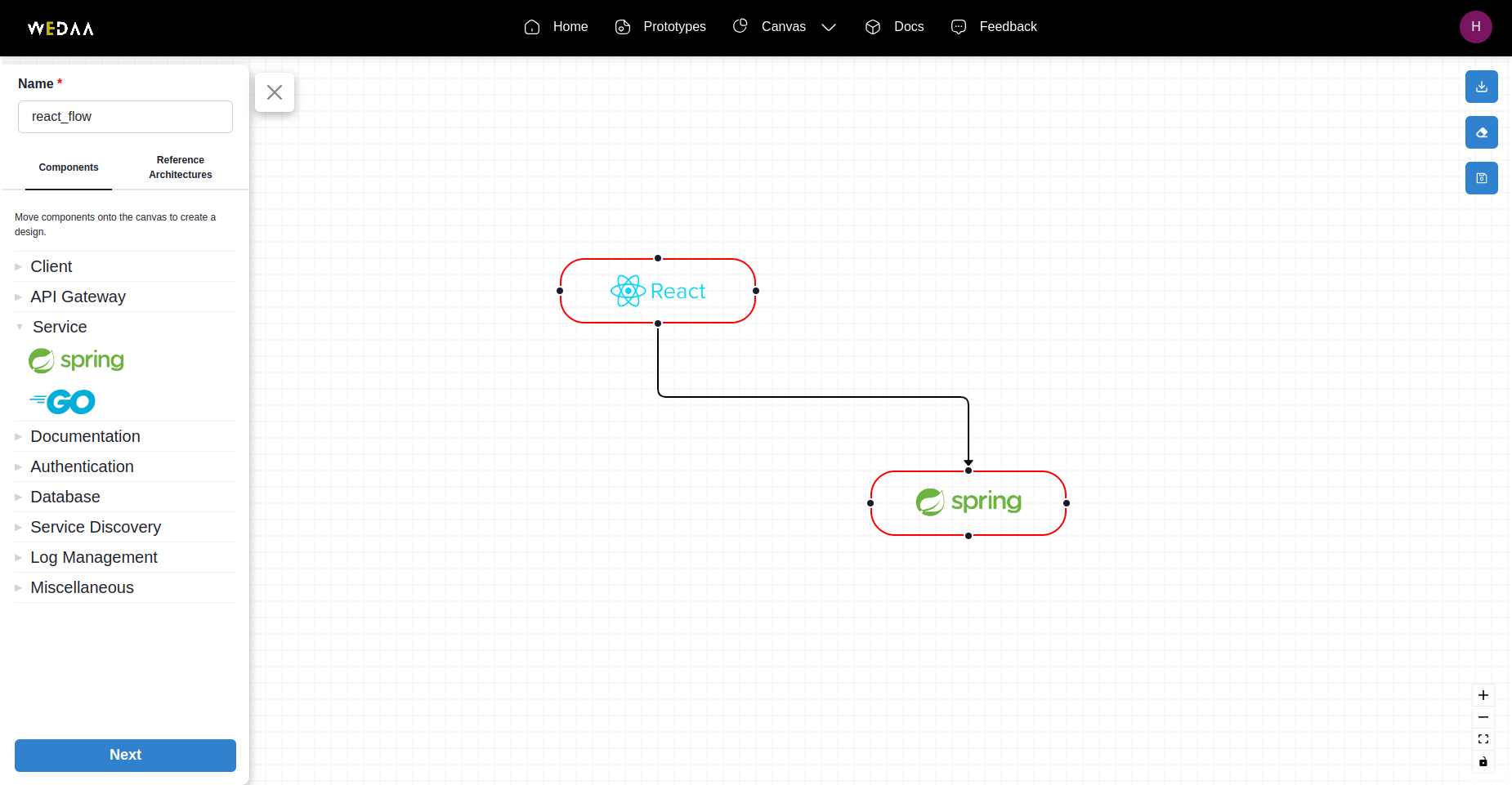
This setup enables seamless edge connections from any side of the node, enhancing the versatility and usability of the React Flow diagrams.
Deleting a node or a edge
To enhance node and edge deletion functionality in a React Flow application, React Flow offers a default deletion function triggered by the Backspace key on the keyboard. However, if the requirement is to extend this functionality to include the Delete key as well, the process can be accomplished by utilizing the deleteKeyCode property and adding the corresponding key codes for the Delete key.
<ReactFlow deleteKeyCode={["Backspace", "Delete"]}></ReactFlow>
Adding Color Options to Nodes
While React Flow doesn't have a direct method for setting specific background colors for nodes, we can achieve this functionality by defining a function to handle color changes and incorporating color options into our node components.
Color Change Function
Let's start by defining the handleColorClick function, which will be responsible for changing the background color of a node:
const handleColorClick = (color) => {
  let UpdatedNodes = { ...nodes };
  setSelectedColor(color);
  (UpdatedNodes[nodeClick].style ??= {}).backgroundColor = color;
  setNodes(UpdatedNodes);
};
This is a code defines a function called handleColorClick. The function takes a single argument, color, which is a string representing the color to set as the background color of a node.
The function first creates a copy of the nodes object using the spread operator, so that the original object is not modified directly. It then sets the selectedColor state variable to the provided color. Finally, it sets the backgroundColor property of the node with the ID specified by nodeClick to the provided color. If the style property does not exist for that node, it will be created and set to an empty object before the backgroundColor property is added to it. The nullish coalescing operator (??=) ensures that the style property is set to an object if it does not already exist.
Adding Color Options
Next, let's add color options to our node component and link them to the handleColorClick function:
<div
  style={{
      width: "30px",
      height: "30px",
      borderRadius: "50%",
      backgroundColor: //desiredColor,
      cursor: "pointer",
  }}
  onClick={() => handleColorClick()} //desiredColor
></div>
Example
The animation below demonstrates changing the color of a node:
By implementing color options and the color change function, you can customize the appearance of nodes in your React Flow diagrams to match your design preferences or convey specific information.
Adding Backgroup Grid to Canvas
In React Flow, the ability to add a background grid to the canvas provides a valuable tool for maintaining precise alignment and enhancing the aesthetics of your flowchart. Whether you're crafting a complex diagram or a simple layout, the grid system ensures that nodes and elements align perfectly, contributing to a well-organized and visually appealing flow chart.
Implementation
To add a background grid to your React Flow canvas, you can use the <Background> component with specific configurations. Here's an example of how to implement it:
<ReactFlow>
  <Background
    gap={} //desired gap between patterns
    color="" //desired color for grid
    variant="" //declaring the type of variant we want to use for grid(line/grid/dots)
  />
</ReactFlow>
In this code snippet, we set the gap prop to define the gap between grid patterns, the color prop to specify the color of the grid, and the variant prop to determine the type of grid variant (lines, grid, dots).
Example
The image below showcases a custom node with a background grid applied to the canvas:
By incorporating a background grid, you can ensure precise alignment and enhance the overall visual appeal of your flowchart or diagram in React Flow.
Saving Node Positions and Dimensions
In React Flow, the onNodesChange function plays a crucial role in handling changes to nodes within the flow. It's often called in response to user actions like dragging nodes, selecting nodes, or removing nodes.
Implementing onNodesChange
First, let's set up onNodesChange in our React Flow component:
<ReactFlow
  onNodesChange={
    (changes) => onNodesChange() //desiredArguments, changes
  }
></ReactFlow>
The onNodesChange callback receives a list of changes when nodes are modified in the flow. We pass these changes to our onNodesChange function to handle updates.
Handling Position and Dimension Changes
Inside onNodesChange, we can handle position and dimension changes using a switch case:
const onNodesChange = useCallback((/*desiredArguments*/, changes = []) => {
  const updatedNodes = { ...nodes };
  changes.forEach((change) => {
    switch (change.type) {
      case "dimensions":
        if (change.resizing) {
          updatedNodes[change.id] = {
            ...updatedNodes[change.id],
            position: {
              ...updatedNodes[change.id].position,
            },
            style: {
              ...updatedNodes[change.id].style,
              ...change.dimensions,
            },
          };
        }
        break;
      case "position":
        // Add logic for handling position changes
        break;
      case "select":
        // Add logic for handling node selection
        break;
      case "remove":
        // Add logic for handling node removal
        break;
      // Handle other cases as needed
    }
  });
}, []);
In this example, we focus on handling dimension changes (change.type === "dimensions") by updating the node's dimensions and style accordingly. You can similarly add logic for position changes (change.type === "position") or other types of changes as required.
Example
The animation below demonstrates saving node positions and dimensions after submitting:
By leveraging onNodesChange and handling different change types effectively, we ensure that node positions and dimensions are updated and saved seamlessly within the React Flow environment.
Handling Edge Changes with onEdgesChange
In addition to managing node changes, React Flow provides the onEdgesChange callback to handle modifications to edges within the flow. This includes actions like adding or removing edges, which are essential for creating a controlled and interactive flow diagram.
Implementing onEdgesChange
Let's integrate onEdgesChange into our React Flow component:
const onEdgesChange = useCallback((nodes, changes = []) => {
  changes.forEach((change) => {
    switch (change.type) {
      case "add":
        // Handle edge addition
        break;
      case "remove":
        // Handle edge removal
        break;
      // Add other cases as needed
      default:
        break;
    }
  });
}, []);
The onEdgesChange function receives a list of changes when edges are modified in the flow. We can use a switch case to handle different types of changes, such as adding or removing edges.
Conclusion
In conclusion, React Flow has played a pivotal role in revolutionizing architecture design within the WeDAA platform. By empowering users to visually construct their architectures using intuitive node-based interfaces, React Flow has enhanced the efficiency and creativity of our users' workflow. Despite the challenges encountered along the way, the integration of React Flow has proven to be a valuable asset in achieving our goal of simplifying microservice prototyping.
Experience Our Visual canvas built using React Flow: WeDAA Canvas